


UX Case Study — Clarus
2025 / Biosensing Travel Health
Project Snapshot
Role / Project Lead, Research, UI Design
Timeline / 6 months
Team / Capstone
Focus / Accessibility, trust, health, travel, clarity
overall task completion rate averaged
S01 — Challenge
91%
overall task completion rate averaged
+2000 pts
Research Data
6 SMEs
50 users
Research participants
The problem
Current wearables track fitness, not infection risk. Public health systems also rely on delayed reports, creating a gap between personal health data and real time outbreak awareness.
The response
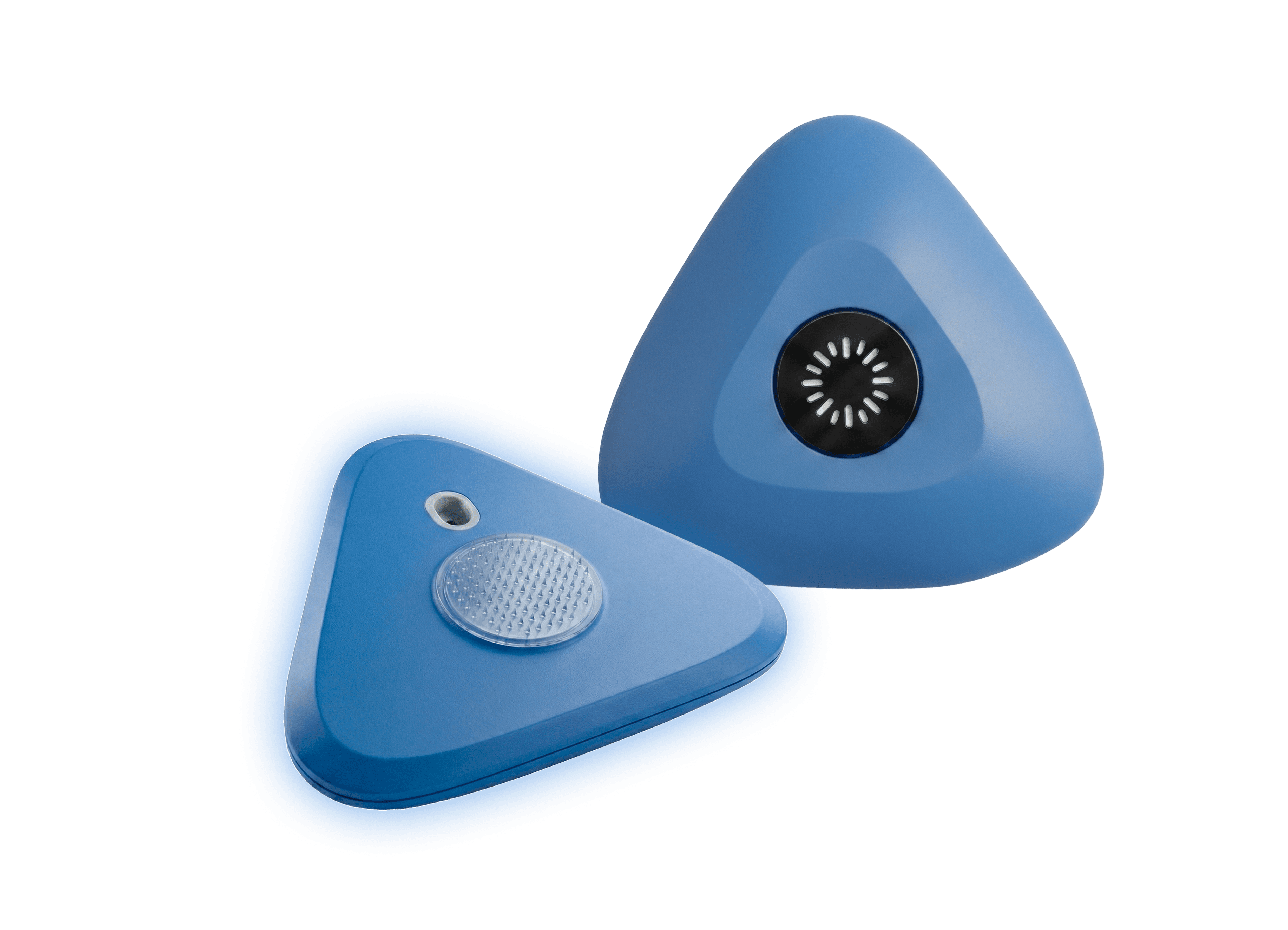
Clarus is a microneedle biosensing patch paired with an app. It tracks early infection biomarkers, alerts travelers sooner, and securely feeds anonymized data into a public health dashboard to support faster outbreak detection.
S02 — Process
01
Research the decision moment
Mapped where travelers check status, interpret uncertainty, and need reassurance before taking action.
02
Clear Health Status Indicators
Translated complex biomarker data into simple, easy to understand status signals with recommended actions.
03
Prototype for trust and speed
Clearly explained how anonymized data contributes to the public health dashboard to increase trust and participation.
Traveler making safer choices away from home
I need clear guidance, not a medical dashboard.
Goals
Travel safely and understand personal risk.
Needs
Simple alerts, reassurance, and next steps.
Frictions
Unclear symptoms and fear of acting too late.
Priority
Make guidance calm and actionable.
Epidemiologist tracking population-level risk
I need enough signal to act early without causing alarm.
Goals
Spot clusters and coordinate response.
Needs
Trends, confidence, location, and thresholds.
Frictions
Noisy data, delays, and limited resources.
Priority
Turn signals into trusted action.
Design response
The dashboard was designed to surface what matters most at a glance, combining a clear health status, recent biomarker changes, and easy-to-understand insights into a simple, actionable experience.

Design response
Design response
Turning Anonymous Health Data into Actionable Public Health Insights
VISION VIDEO
The video frames Clarus as a calm, proactive travel companion: detecting risk early, translating biosignal changes into understandable guidance, and helping users decide what to do next without panic.
Narrative
User-first story
Concept
Early detection
Alignment
Shared vision


S03 — Impact
What changed
Testing showed that users moved faster when the interface separated the signal, the meaning, and the next action. The strongest improvement came from simplifying health language and making recommendations feel trip-aware instead of generic.
Final outcomes
Selected as a Red Dot winner
Task completion increased from 62% to 85%.
Prototype clarified accessibility and trust requirements for future product direction.
Our Final Concept
Hey! Open for work Q3